How about redesigning Cricket Scorecards?
Data Analytics and Visualization have benefitted professional teams and players in a number of ways. But the ardent Cricket fan is still left with traditional reporting styles to be happy with.
In our attempt to bring data visualization to the fans of the game, we have been experimenting with different scorecard forms that bring an insightful enjoyable cricketing experience for digital audiences.
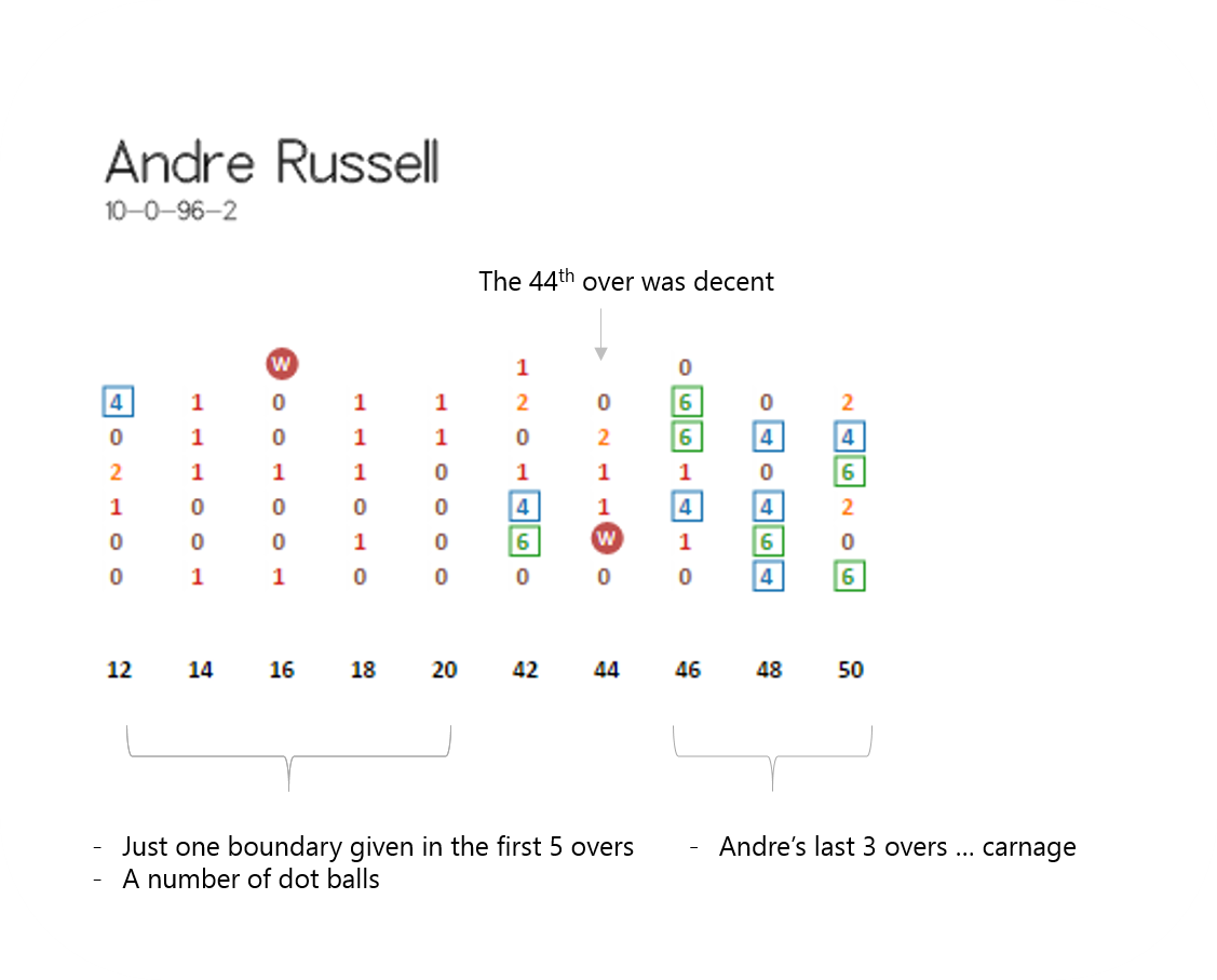
Here is a starter. This is how Andre Russell's bowling figures looked in the World Cup quarterfinal against New Zealand.
10-0-96-2
Beaten black and blue throughout is what one thinks seeing that bowling figure. But lets plot every ball Andre Russell bowled in the match and you begin to see a totally different picture.
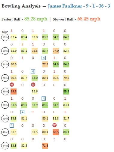
Here's a different view with bowling speeds. This one is Faulkner's bowling performance against New Zealand in the World Cup 2015 Final. Notice that 2 of the 3 wickets fell to slower deliveries? The 6th ball of the 36th over and the 5th ball of the 42nd over were Faulkner's fastest and slowest deliveries respectively in the match. In the interactive versions of these scorecards hovering over every run would show additional information.
Here's how a ball-by-ball scorecard for the West Indies Vs New Zealand QF Match looks. The interactive scorecard for this match is available here.
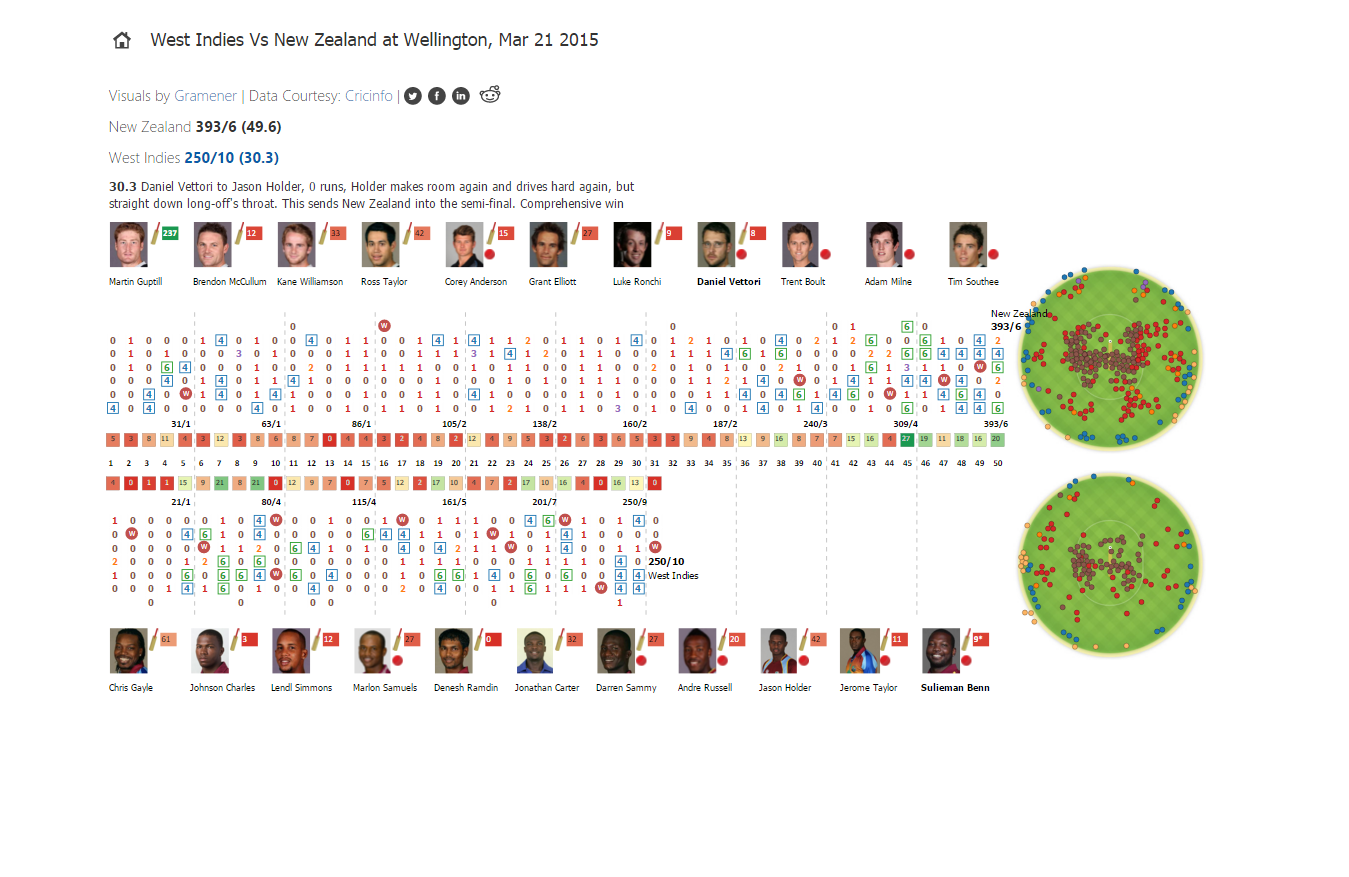
You can explore the ball-by-ball scorecards of every match of the 2015 World Cup over here. This ball-by-ball approach allows digital audiences have a holistic picture of the game. One more reason to love this crazy game. You can reach us with your suggestions and comments at contact@gramener.com.