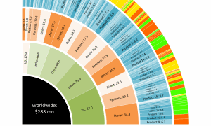
The visualization on the right gives an over view of various songs sold, while letting user click-through and drill-down to a custom view across 4 different levels. Size is always proportional to number of songs sold and levels include total songs sold, country-wise breakup, channel-wise breakup and gener-wise breakup of songs sold. Color tells about the growth of songs sold ranging from red to green (0-20%).
The visualization above shows market opportunities across various countries to identify areas of focus. This chart has been built as an interactive-app to present the key findings, while letting user click-through and drill-down to a custom view across 4 different levels. Size is always proportional to size of prize and levels include total opportunities worldwide, country-wise breakup, channel-wise breakup and product-wise breakup of price respectively. The top most level shows category-wise breakup of price (Color tells if it has accelerated, grown or caught-up)
