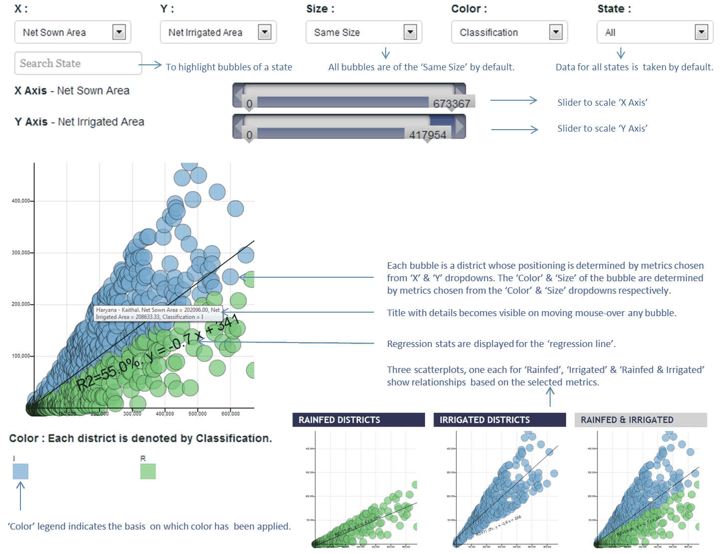
This is an Interactive Scatterplot tool that helps do custom analysis and compare characteristics of Rainfed and Irrigated Areas, shown in separate plots along with a 'Rainfed & Irrigated' plot that portrays the national scene.
Each bubble represents a district.
Choose a metric for 'X', 'Y' ,'Size of bubble', 'Color of bubble' & 'State' from the drop-down to draw the scatter plot.
All bubbles are of the 'Same Size' by default.
Data for 'All' states is taken by default. One could choose specific states to see relationships for the selected state.
A straight-line is fit through the bubbles to show relationship.
The scatterplot includes 99 percentile values and excludes the top 1 percentile outliers.

Close by clicking anywhere outside the window

