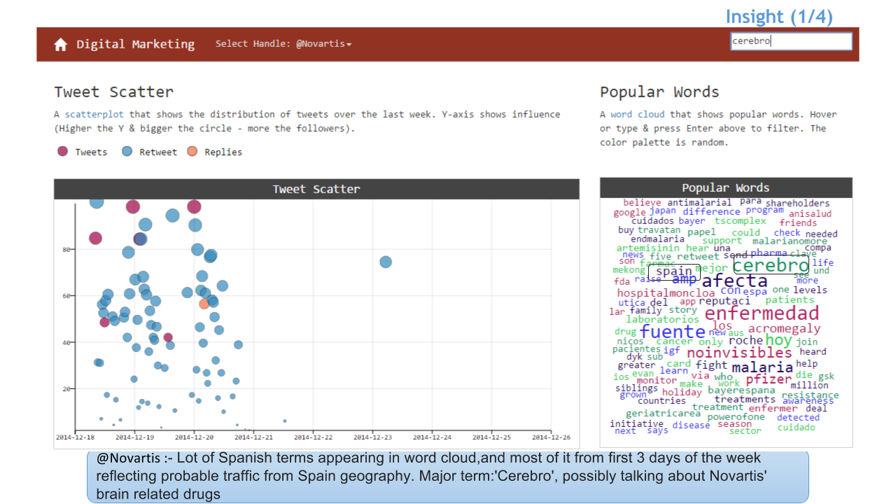
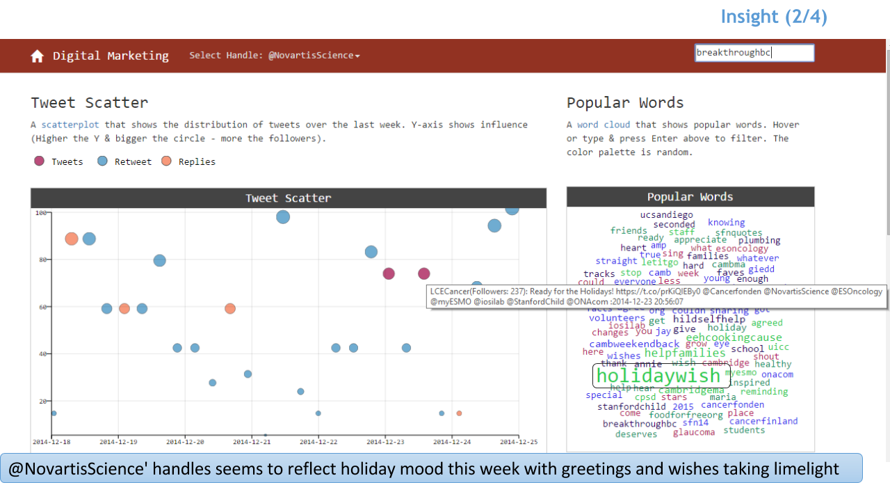
A scatterplot that shows the distribution of tweets over the last week. Y-axis shows influence (Higher the Y & bigger the circle - more the followers).
Tweet Scatter
Popular Words
A word cloud that shows popular words. Hover or type & press Enter above to filter. The color palette is random.
Popular Words
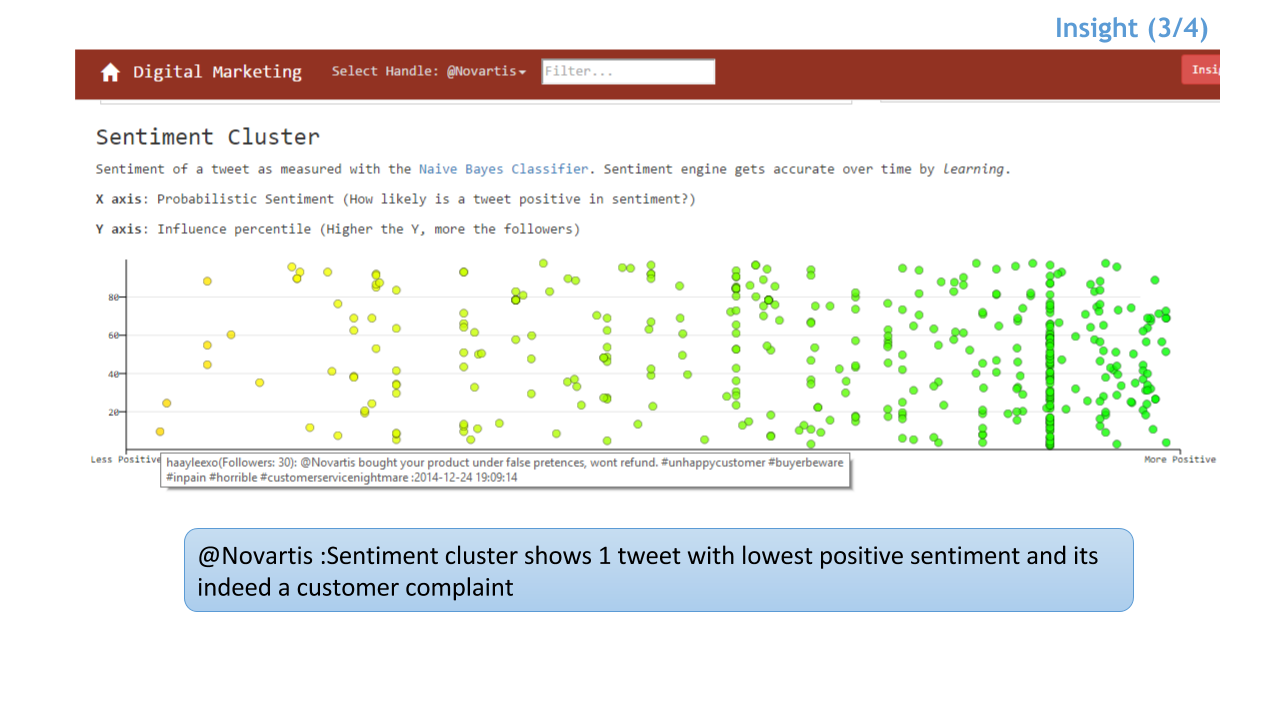
Sentiment Cluster
Sentiment of a tweet as measured with the Naive Bayes Classifier. Sentiment engine gets accurate over time by learning.
X axis: Probabilistic Sentiment (How likely is a tweet positive in sentiment?)
Y axis: Influence percentile (Higher the Y, more the followers)