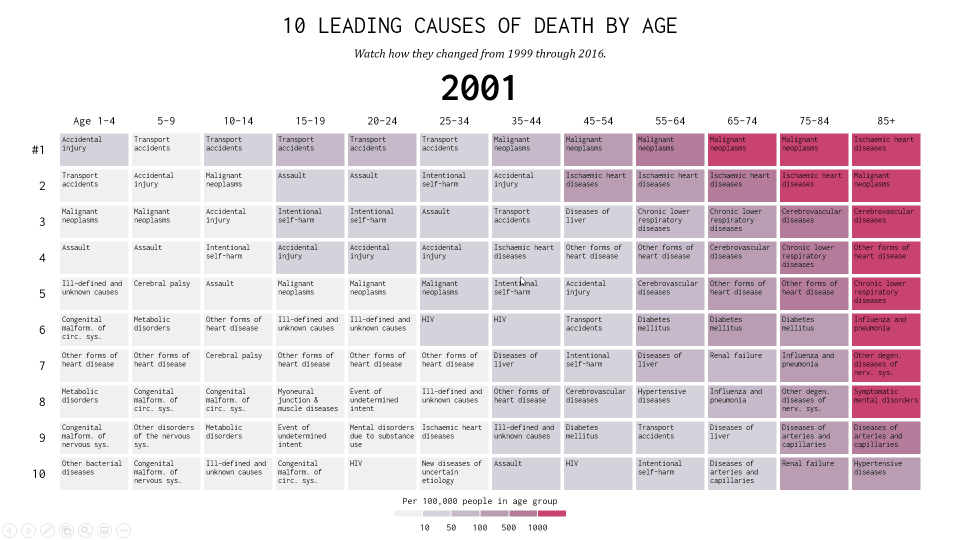
Shifting Causes of Death
Let’s see how we can create this visual on the “Shifting Causes of Death” using PPTXHandler.
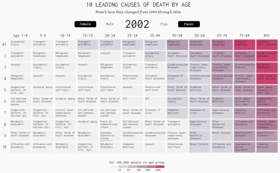
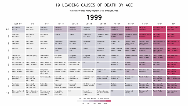
This shows the top 10 causes of death by age group, across years. Data is from the CDC Wonder Database, and the visualization was created by Nathan Yau.
Create the source template
Start by creating a template.pptx that has the static content laid out.
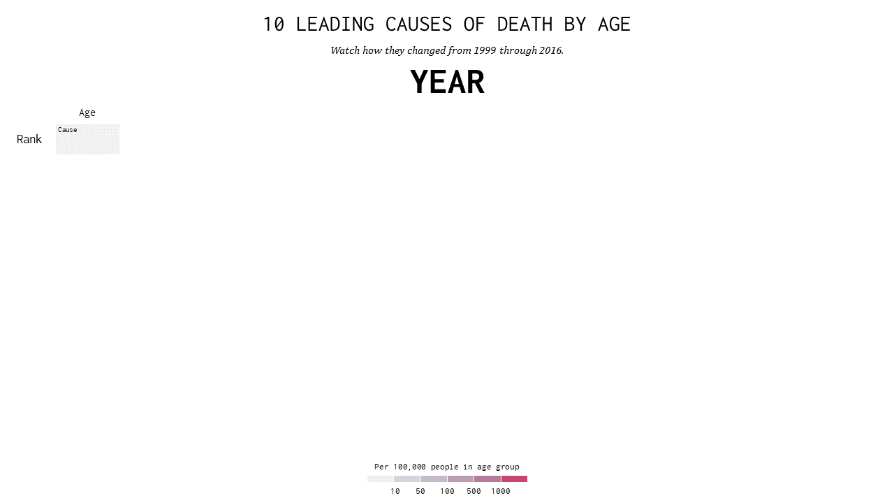
It has 4 shapes that will be updated from data:
Year: the current year, e.g. 1996, 1997, …Age: the age group, e.g. Age 1-4, 5-9, …Rank: the rank of the cause of death, e.g. #1, 2, …Cause: the actual cause of death, e.g. Assault, HIV, …
Create the data
The data is available from the Flowing Data website. To simplify things, we combine Male & Female rates, re-rank them, and save this as mortality.xlsx.
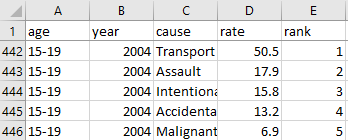
The relevant columns correspond to the shape names on the template:
age: the age groupyear: the current yearcause: the actual cause of deathrank: the rank of the cause of death
Create the rules
Let’s set up a basic gramex.yaml file that loads the template and the data.
url:
  pptxhandler/death:
    pattern: /$YAMLURL/output.pptx
    handler: PPTXHandler
    kwargs:
      version: 2
      source: $YAMLPATH/template.pptx
      data:
        url: $YAMLPATH/mortality.xlsx
        transform: data[data['rank'] <= 10]
Now, we’ll set up a rule that copies the slide for each year.
rules:
  - copy-slide: data.groupby('year')
This copies the slide for each year. The variable copy.key holds the year. copy.val has the data for the year.
Next, let’s set the year on each slide:
"Year":
  text: copy.key
Now, we’ll clone the Rank shape for each rank from 1 to 10.
Rank:
  clone-shape: '["#1", 2, 3, 4, 5, 6, 7, 8, 9, 10]'
  add-top: clone.pos * 0.5
  text: clone.val
We explicitly set the ranks as an array. The first rank is shown as #1. The rest are 2, 3, …
add-top: moves the cloned Rank down by clone.pos * 0.5. clone.pos goes from 0 to 9. So the
first Rank #1 is at the original position. The rest move down by 0.5” (half-an-inch – determined
by trial-and-error) from the previous.
The text shown is the value in our clone-shape: array.
![]()
Now, we’ll clone the Age shape for each age in the dataset.
Age:
  clone-shape: copy.val.groupby('age', sort=False)
  add-left: clone.pos * 1
  text: clone.key if clone.pos else f'Age {clone.key}'
We clone based on the current slide’s value (copy.val), grouped by age. This creates one clone
per age group. Don’t sort it, because it’s already sorted in mortality.xlsx
(and sorting would mess it up: 5-9 would appear after 55-64.)
add-left: moves the cloned Age right by clone.pos * 1. clone.pos counts the
age groups from 0 .. 11. So the first Age 1-4 is at the original position. The rest move right by
1” (one inch – determined by trail and error) from the previous.
The text: is set up to show Age 1-4 in the first column, 5-9 on the second, and so on.

Now, we’ll clone the Cause shape for each row in the dataset.
Cause:
  clone-shape: copy.val
  add-top: clone.pos % 10 * 0.5
  add-left: clone.pos // 10 * 1
  text: clone.val.cause
  fill: >
    '#f0f0f0' if clone.val.rate < 10 else
    '#d4d4dd' if clone.val.rate < 50 else
    '#c6b9c9' if clone.val.rate < 100 else
    '#ba9cb3' if clone.val.rate < 500 else
    '#b67b9a' if clone.val.rate < 1000 else
    '#ca4471'
copy.val has every row of data for the current year. There are 120 entries – for 12 age groups
and 10 ranks. Rows 1-10 are ranks 1-10 for age 1-4, then for age 5-9, etc.
add-top: clone.pos % 10 * 0.5 moves the cloned Cause 0.5” down based on rank. add-left: clone.pos // 10 * 1 moves the cloned Cause 1” right based on age group.
text: clone.val.cause uses the “cause” field to set the text.
The fill color is set in line with the legend we created on template.pptx.
Finally, to animate the slides, let’s set a transition.
          # Add this under the "Cause:" shape
            name: f'!!{clone.val.age} {clone.val.cause}'
          # Create a rule for slide transitions
          transition:
            type: f'morph'
            duration: 0.3
            advance: 1
The transition takes 0.3 seconds per slide, and waits for 1 second before auto-advancing.
This almost works magically… but there’s one problem. It moves the causes from one age-group column to another. We want them to stay within the same column.
We can use the shape name to match morph shapes. By setting the name:, the shape name will be !!1-4 Accidental injury, !!1-4 Assault, etc. These will be moved only within the same age group, and not across.
Automated insights
Let’s go a step beyond, and add simple automated insights to this. The rankchange column has the number of ranks a cause has jumped. We can find which rank jumped up or down the most, and add a simple annotation in the subtitle, like “Metabolic disorders changed -4 ranks for age 5-9”.
First, let’s find the row that has the maximum change – positive or negative – and store it in a variable maxrow.
data:
  maxrow: copy.val.rankchange.abs().idxmax()
Next, let’s change the Subtitle shape.
Subtitle:
  text: f'{copy.val.cause[maxrow]} changed {copy.val.rankchange[maxrow]:+0.0f} ranks for age {copy.val.age[maxrow]}' if maxrow == maxrow else None
copy.val.cause[maxrow]shows the cause name, e.g. “Metabolic disorders”copy.val.rankchange[maxrow]shows the number of ranks it changed, e.g. -4copy.val.age[maxrow]shows the age group of the change, e.g. 5-9maxrow == maxrowis a hack to check if there is any row that has the highest change. For the first year (1999), there is no change. So we don’t change the text in that case.
This is the final configuration
See the result