Bar Chart Race
Let’s see how we can create a bar chart race in PowerPoint, using the copy-slide: command.
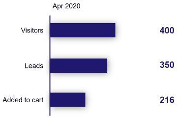
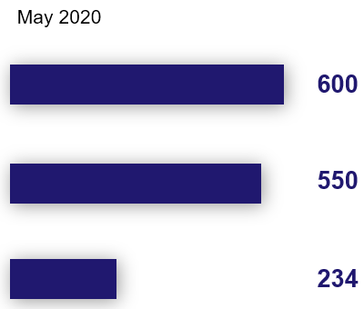
This first row shows the number of visitors who arrive on a shopping website every month. The second row shows how many of these are converted into leads. The third row shows the number that added an item to the shopping cart.
We will create 3 slides – one for each month, containing this data.
Here’s a video explaining each step of this tutorial.
Create the source template
Start by creating a template.pptx like this:
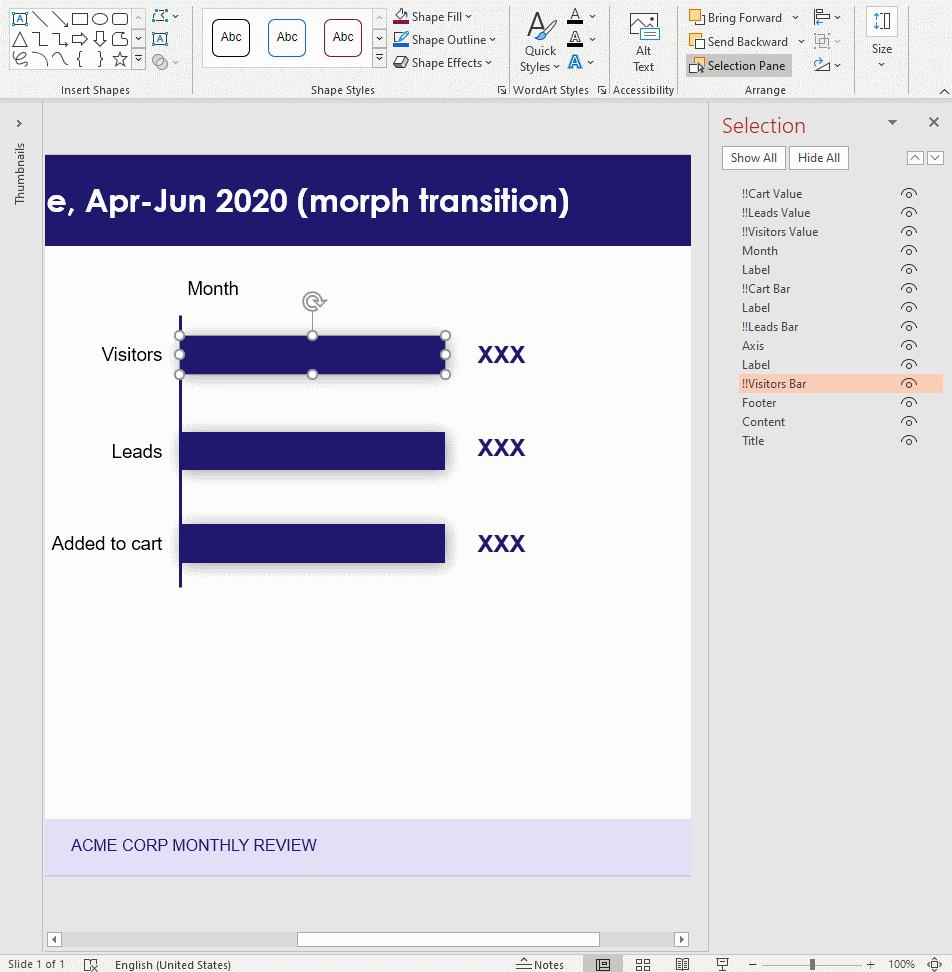
The relevant shapes are:
- 3 rectangles, named “!!Visitors Bar”, “!!Leads Bar” and “!!Cart Bar”
- 3 text boxes, named “!!Visitors Value”, “!!Leads Value” and “!!Cart value”
- A text box named “Month”
Shape names begin with !! so that PowerPoint’s Morph transition will match the shape across slides.
Create the data
The data is in a CSV file: sales.csv.
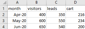
It has 4 columns:
month: Each row represents data for a month. Themonthcolumn specifies which monthvisitors: Number of visitors to the site each monthleads: Number of visitors who converted into leads each monthcart: Number of visitors who added a product to the shopping cart each month
Create the rules
Let’s set up a basic gramex.yaml file that loads the template and the data.
url:
  pptxhandler/morph:
    pattern: /$YAMLURL/output.pptx
    handler: PPTXHandler
    kwargs:
      version: 2
      source: $YAMLPATH/template.pptx
Next, we load the data.
data:
  sales:
    url: "$YAMLPATH/sales.csv"
    transform: data.set_index('month')
  max_visitors: { function: sales.values.max() }
sales is loaded from sales.csv. But we also set the month column as the index.
This makes it easy to calculate our next (derived) value, max_visitors.
max_visitors is the maximum of all the numeric columns. We need this to scale the bars.
Next, we create one slide for each month using copy-slide. It loops through
each row in the dataset sales.
rules:
  - copy-slide: sales
    transition:
      type: f'morph'
      duration: 1
We also apply a 1-second morph transition for the bars to animate smoothly into each other.
Next, we set the widths of the bars.
"!!Visitors Bar":
  width: (copy.val['visitors'] / max_visitors) * 3
"!!Leads Bar":
  width: (copy.val['leads'] / max_visitors) * 3
"!!Cart Bar":
  width: (copy.val['cart'] / max_visitors) * 3
copy.val has the value of each row in sales. Dividing by max_visitors, we get a number
between 0 - 1. We multiply by 3 to scale it to 3 inches. The default length
units are inches.

Then, we set the text of the labels on the right.
"!!Visitors Value":
  text: copy.val['visitors']
"!!Leads Value":
  text: copy.val['leads']
"!!Cart Value":
  text: copy.val['cart']
Finally, we show the month on the title.
Month:
  text: "copy.key"
copy.key has the index of each row in sales. Since we set the month as the index, it has the current month.
This is the final configuration
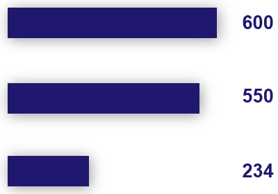
See the result